

BYART
“Classy, Glass.”
BYART
“Classy, Glass.”

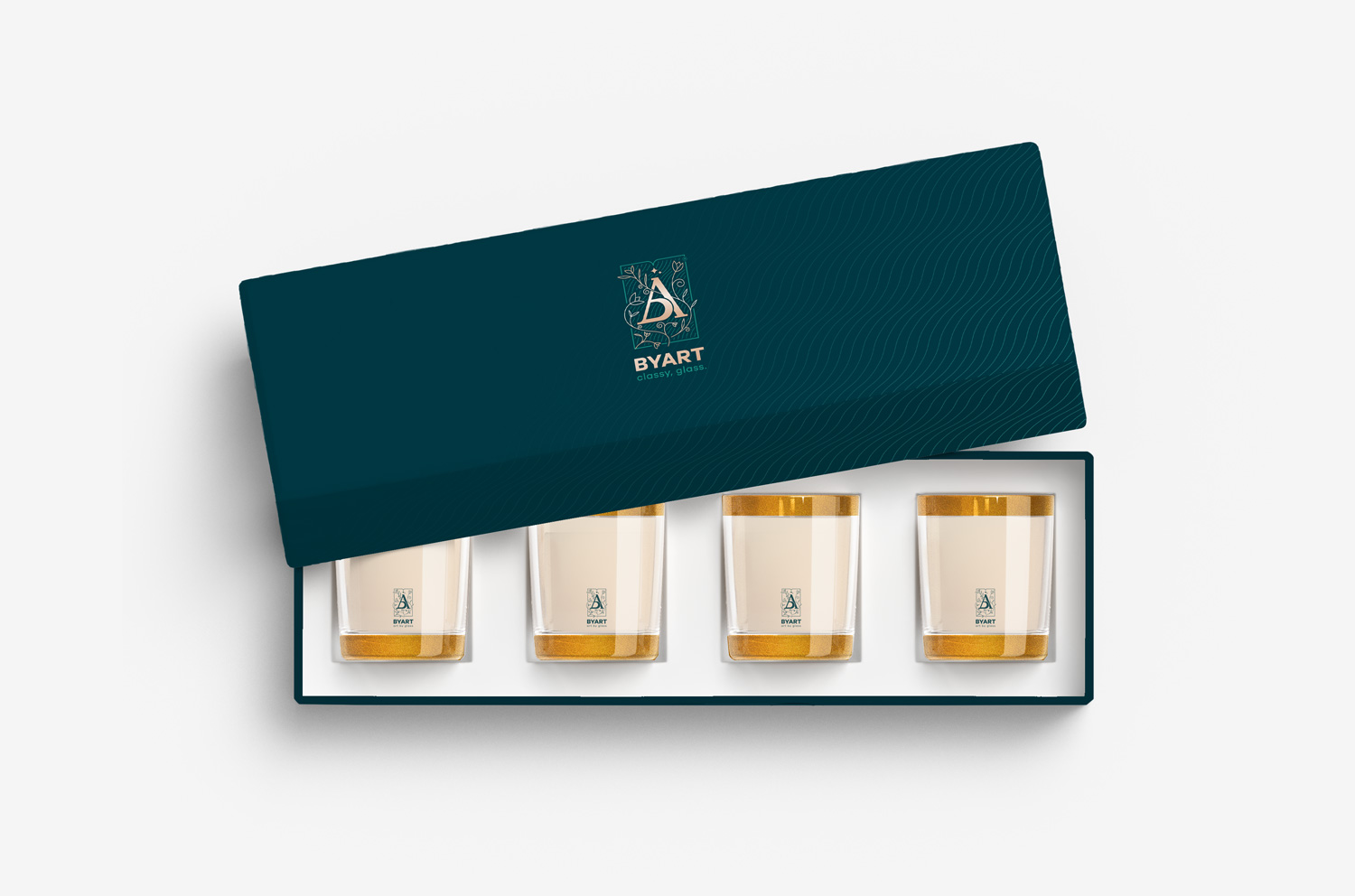
When Byart came to Monogram, it was a company that prepared for the export market and aimed to stand out with the machines produced by it in this market. They needed a distinctive logo and packaging that would make their products stand out and stand out on the shelf.
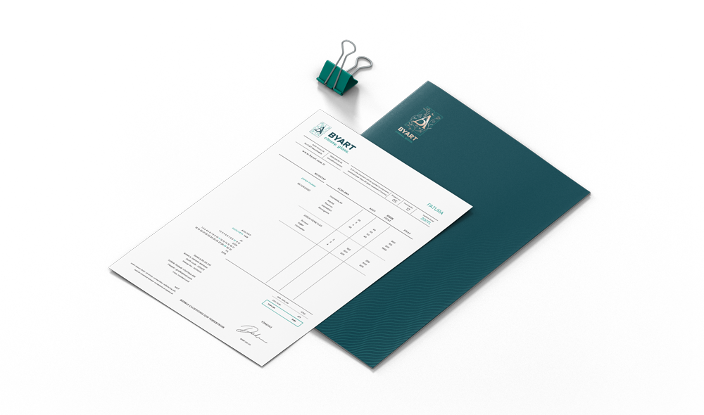
Selected design and packaging applications for BYART were developed to strengthen the perceived value of the products through a strong visual language and carefully considered production details. This page brings together different applications from the project.
Selected design and packaging applications for BYART were developed to strengthen the perceived value of the products through a strong visual language and carefully considered production details. This page brings together different applications from the project.
Selected design and packaging applications for BYART were developed to strengthen the perceived value of the products through a strong visual language and carefully considered production details. This page brings together different applications from the project.

Selected design and packaging applications for BYART were developed to strengthen the perceived value of the products through a strong visual language and carefully considered production details. This page brings together different applications from the project.
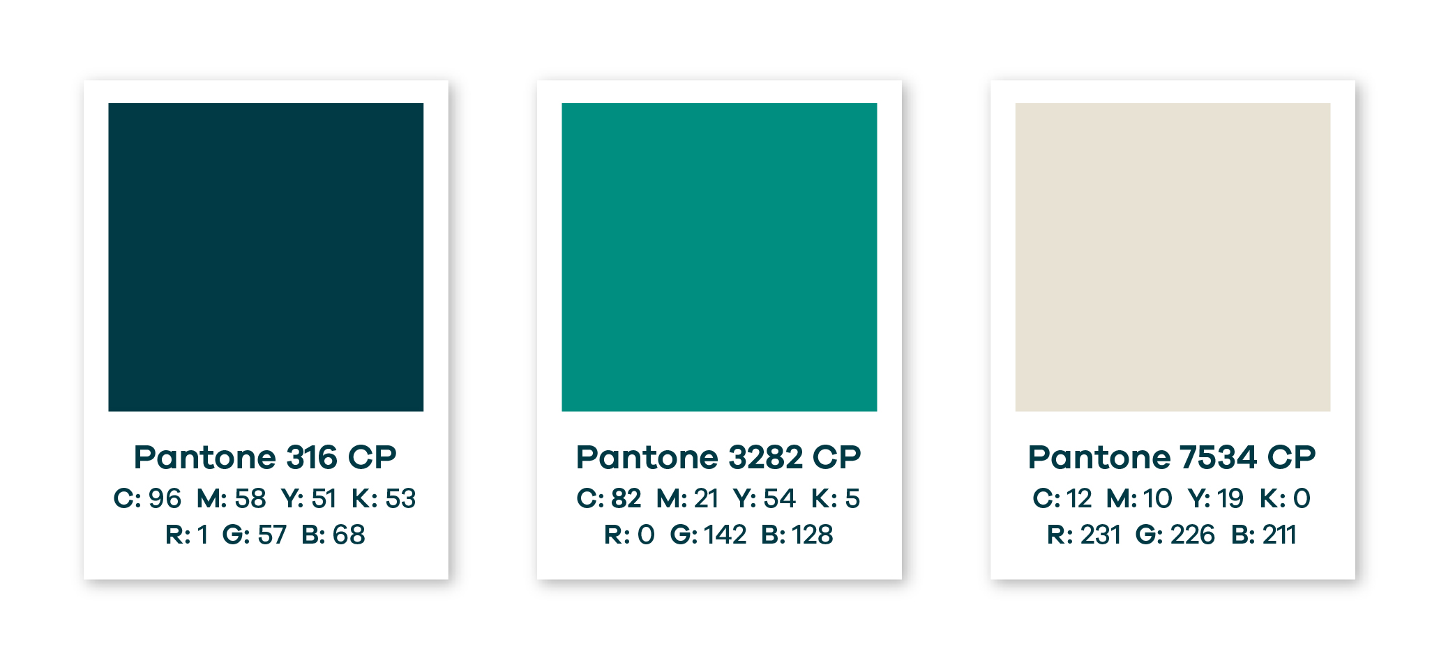
The Story of Colors,
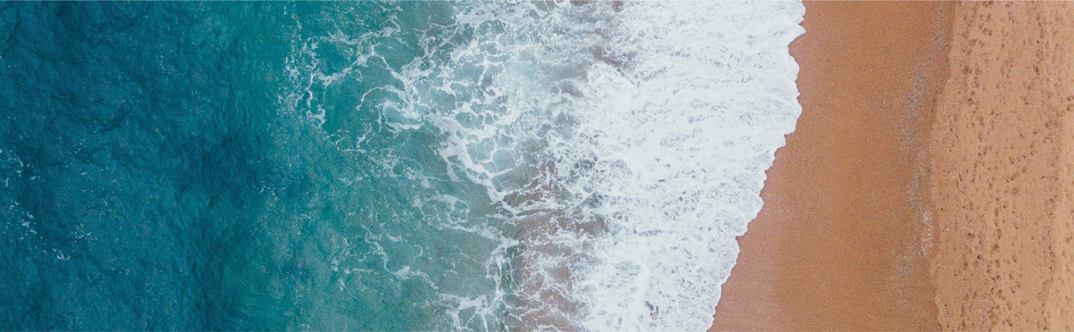
In the formation of the glass, sea and sand are the leading roles of the story. When we designed our colors, we carried the colors that reflect the vastness of the sea, the depth and the safety of the sand, inspired by this completely natural duo.
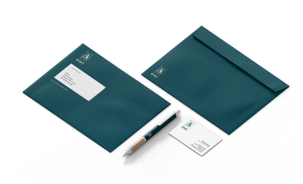
The visual language created for BYART focuses on presenting the brand’s products and identity in a simple, strong, and consistent way.